
Bears didn't do it. I think 5300 is next target.
Bears didn't do it. I think 5300 is next target.
Very likely making a reversal. Bears did not impress.

I think we’re going to be changing our swing bias towards a new high and possibly to an extended one (Not just the bat spike out). We’ll provide full analysis and rational as well as specific zones to trade from in future update. I expect a retracement to enter long into, no immediate action taken.
In this post, we’ll do a comprehensive explanation for a possible amended target of 5300 (With expected high on an overshoot of that). This post is long but in it I cover things that have taken me years to learn and I think could be really useful.
First thing we’re going to do is take the simple bubble template and make it more in line with the real moves of a market.

When zoomed out enough, the mega bubbles in an index looks a lot like the template.

If you were making forecasts on this consulting the simple template you could have made a reasonably good one if you were working with it from this far out a perspective. But being able to know the broad strokes of this would have at times done more harm than good in practical application.
An analogy for bubble formation
A bubble becomes more dangerous as it becomes more fun.
It’s like if a small group of people start playing hockey on a frozen lake. Everything starts nice and safe and there’s a bit of fun to be had. Then more players show up. Fans show up. People to entertain the fans show up. A carnival on the ice builds up. Before you know it, someone’s got a BBQ on the go.
It’s all getting a lot more of a fun place to be, but you’re taking your chances. The stages of a trend are the same if we class “Fun” as profit available and “Danger” as long lasting market declines (Not corrections, reversals in the general trends of markets). In a carnival on the ice we may measure decibels or empty bear cans, in a trend we measure angle of trend and volatility.
Now we’ll look at how these change in different phases of the trend.
Stages of trend maturity
During the initial main advance of a trend the trend forms in a structured way. Any crash risk is nominal and can be easily avoided with simple stops under recent lows. The trend is incredibly persistent overall but it’s up a bit, down a bit and up a few bits more. Edging higher over time.
This transitions into a stage where price goes up much more sharply. The sharp move has no big bear moves in it at all until it suddenly starts to lose stability.

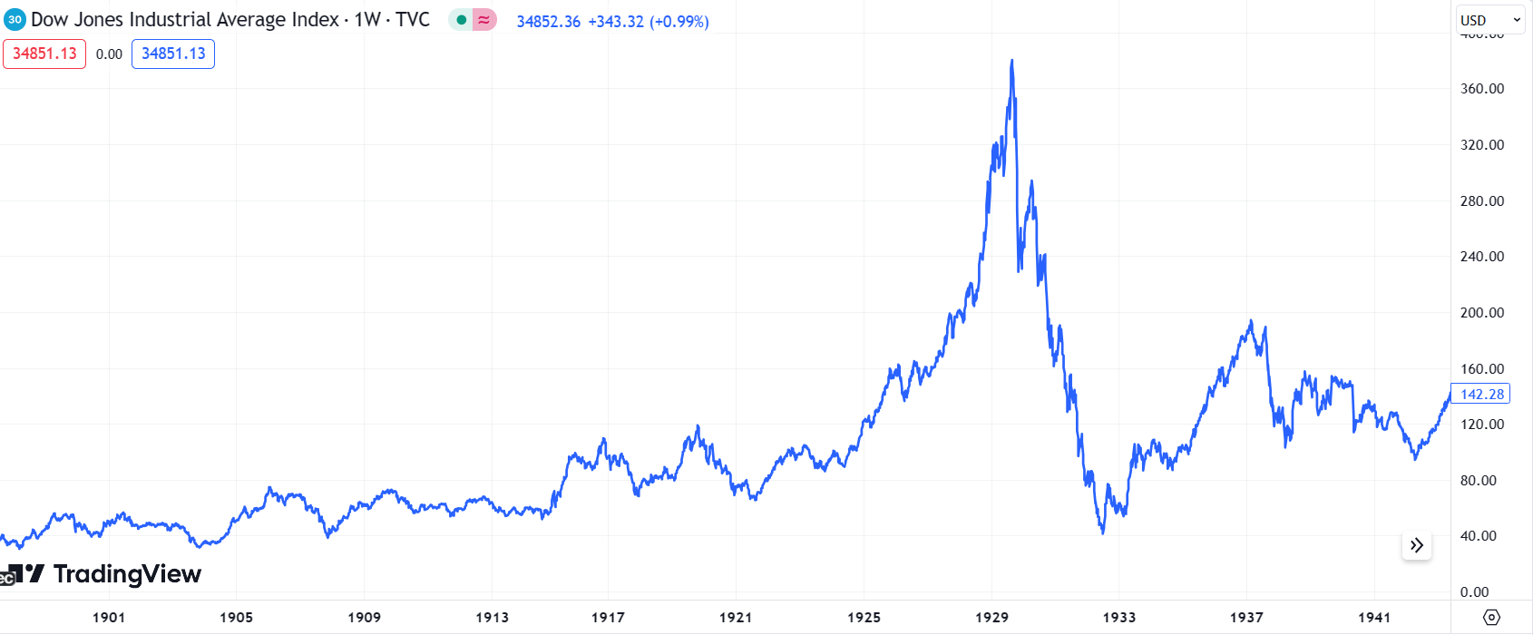
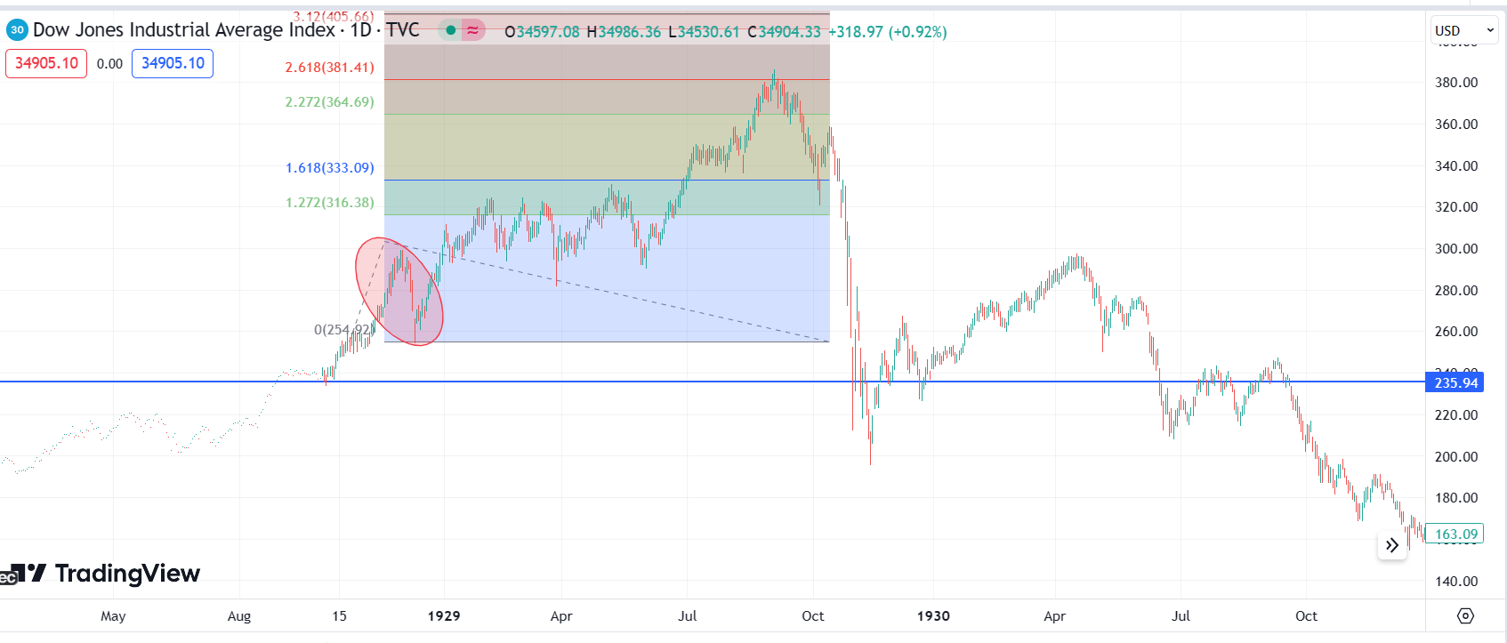
This is where the basic model starts to fail. Using the simple model we clearly have moves looking like the top and break and the “Return to Normal” phase can be mis-forecast many times. Many times! I’m showing you a DJI 1929 chart which was incredibly friendly in its lack of whipsawing and trickery. They got worse.
Next there’s the warnings and traps. People have been brought to the market by its stable trend and growing gains but right about the time they are arriving in hoards, the market stops doing the very thing they came for. It becomes much easier to lose money. During this time, bear emerge.
Retrospectively, this period of bear moves can been seen to have been an early warning.

The areas this is happening in will prove to be important levels to price later but what actually happens at the first visit to this zone is something that greatly affirms the belief the trend will continue. This is the part where dumb people look smart and smart people look crazy.
A massive move will come. It’ll serve to run the stops of the bears, draw in masses of new investors/speculators. It will annul any fears of whatever narratives of market risk may have built up in the scary period and even be enough to make people believe this market can defeat anything! Even when obvious bad things happen, it’s ignored.
This is the magnificent final display of the bull. The epic crescendo that all the earlier action has been building up to. Getting increasingly dramatic, but still leaving room for you to be further impressed with closing showing.

And obviously that’s the bit the average person gets hurt. It’s very hard to warn anyone of anything at this time because the false “Return to Normal” forecast has been made so many times and the bull market has “Silenced critics” (Tend to see that said about things close to their highs).
Extrapolating this to modern charts
There are two things essential to do when looking to model a market move and then apply that model to a different market. These are to have a way to filter out noise and unimportant variances and focus on finding “Chunks” of price action. The other is to avoid curve-fitting.
We do both of these by trying our best to forget any other context/bias we may have and simply asking ourselves if we had to create a model from the DJI 1929 chart for how a trend forms and tops, what are some observations we could make? Are there stick out points? Is any bit really obvious? Can we phase the market using things that we can realistically spot in real time if we’re watching it again and is also statistically unlikely we’re going to see just by chance.
These are observations you 100% could have made.
Breaks down into 4 main phases (Steady rise, sharp rise, scary section, exceptional top)
From steady to sharp rise significant change in trend angle
Scary section has wild drops but they look small after
The angle of trend in final climb is steepest
These are simple observations. If all you had was this chart, a crazy metaphor about ice carnivals and understanding angle of trend and changes in volatility should be noteworthy, this is a realistic set of rules you could set out to phase a trend. I’m going to give you more technical ones later, but let’s apply this to modern times.

And this is actually quite surprising, right? Given that it really would be practical for anyone to define these phases and rules from a 1929 chart (With some prompts on what to look at) and then you do have all of these things, in the right order, in the current chart.
They’re not small things. It takes a lot for the angle of a trend that’s been going on for years to dramatically and consistently change. If the market is mainly going up and goes down in simple spots, that’s improbably in a random walk. This isn’t simply finding patterns you’re looking for.
It seems the market behaviour changed in the same ways and these were significant changes.
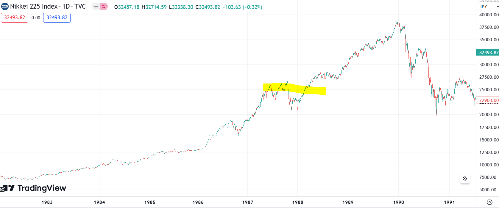
How would these stand up against a more recent example that we know produced a crash. The first thing we should note is we can see this basic structure in a market without it producing a huge crash. We’re going to look at the huge crash in the Nikkei but here’s an example where we have the general phases and a lesser crash.

Japan would come of this little crash and it would do this.

And again here we can see where our phases template would have worked. It’s really obvious. I don’t have to mark it into the chart. Surely no one who can not see that’s obvious would have read this far!
So there you go. There’s the phases of a bubble that give you everything you know to master all bubbles for the rest of your life. Easy!
Not quite.
It’s useful and it’s a start, but what we have here is woefully vulnerable to devastating false signals without a good way to escape from them. If we do an honest assessment, in real time these rules are 100% going to have you thinking this is about to capitulate.

It looks like a lay up.
But you’d have just got hammered.
Later, with the context of this chart you’d have understood you must have gotten caught in the scary section. In real time, you’d have probably thought you’d seen this loss of stability and scary section already. Only in a greater context can you see the mistake.
Broader context is not something you have to make decisions. We need to try to find ways to refine our model rules so instead of us just having vague phases we have some sort of rules to tell us when we’d most likely get a the reversal and specific rules that we can apply in real time to tell us when what we think is not working.
I was interested in using this stuff to trade shorter terms booms and busts (They happen all the time on 15 minute charts) and found various really good ways to add fib rules to this stuff to give practical trading plans rather than useful theoretical models. These have worked well for me and back test well against other crashes.
I try to do these posts with no “Trust me, bro” stuff and back up everything I say but in the interests of keeping the post from being a book we’ll just focus on two big crashes. We’ll take the first one (DJI) because it’s a great model (Albeit without as many stop hunts) and the the recent crash in BTC.
We’re using BTC was a few reasons. One, to show market diversity. In theory, a model of DJI in 1929 should not help in any way with BTC in 2022. Won’t go through all the reasons, that’d be a book - we all know. They are different things in different times. Secondly, I have the real time BTC forecasts showing real time application of theory.
This analysis does not use the BTC crash you’ll be thinking of. It’s on the initial crash that made the fake recovery. I’m using this because this is the section of the move where I fully used the DJI model 1:1 (With the most nominal of adjustments based on real trading experience in the modern age).
Here’s the full post and here’s a snippet from it showing the BTC forecast of a drop from the first big high to the first big low.

The targeting of the 161 swing here was based on a targeting rule from the DJI of 1929. The initial drop would go to the 161.
And I knew this targeting rule was good because I’d successfully took profit at almost the exact low of the 2020 crash (And I use this in day trading all the time).
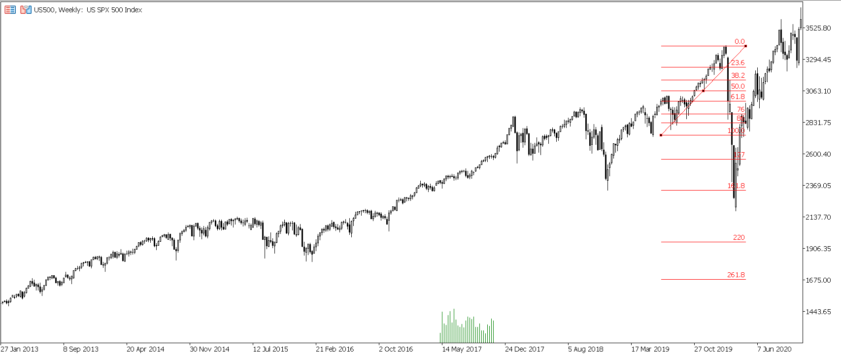
.This is also the current low in SPX.

In all instances here, I bet on the shallow bull trap and in all instance it failed, but in all instances I did catch almost every significant swing in the bear market (And with each instance of this happening I improved my exit/reverse price to avoid the rallies using lessons learned before).
When I put the BTC and the current SPX chart together you should see why I was quick to cut my bear thesis and prep for rally in the highlighted part.

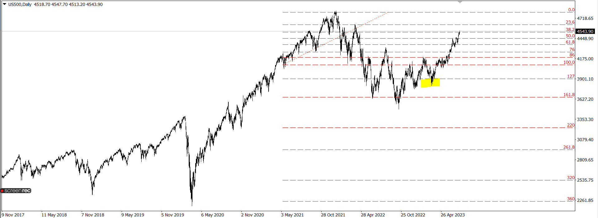
Straight away when I knew we were up off a 161 and the simple follow through stuff was not happen it reminded me of BTC and I knew I hated the next bit. Did some more work to make sure I had a solid plan that back tested well and put out a forecast for essentially the BTC move.

This type of bat spike out breaks the basic bubble template - but actually in practical trading is fine. We can see this into highs. Read a full post about this here.
A target on this would be just a little above the previous high. Here’s another way we can arrive at a similar level.
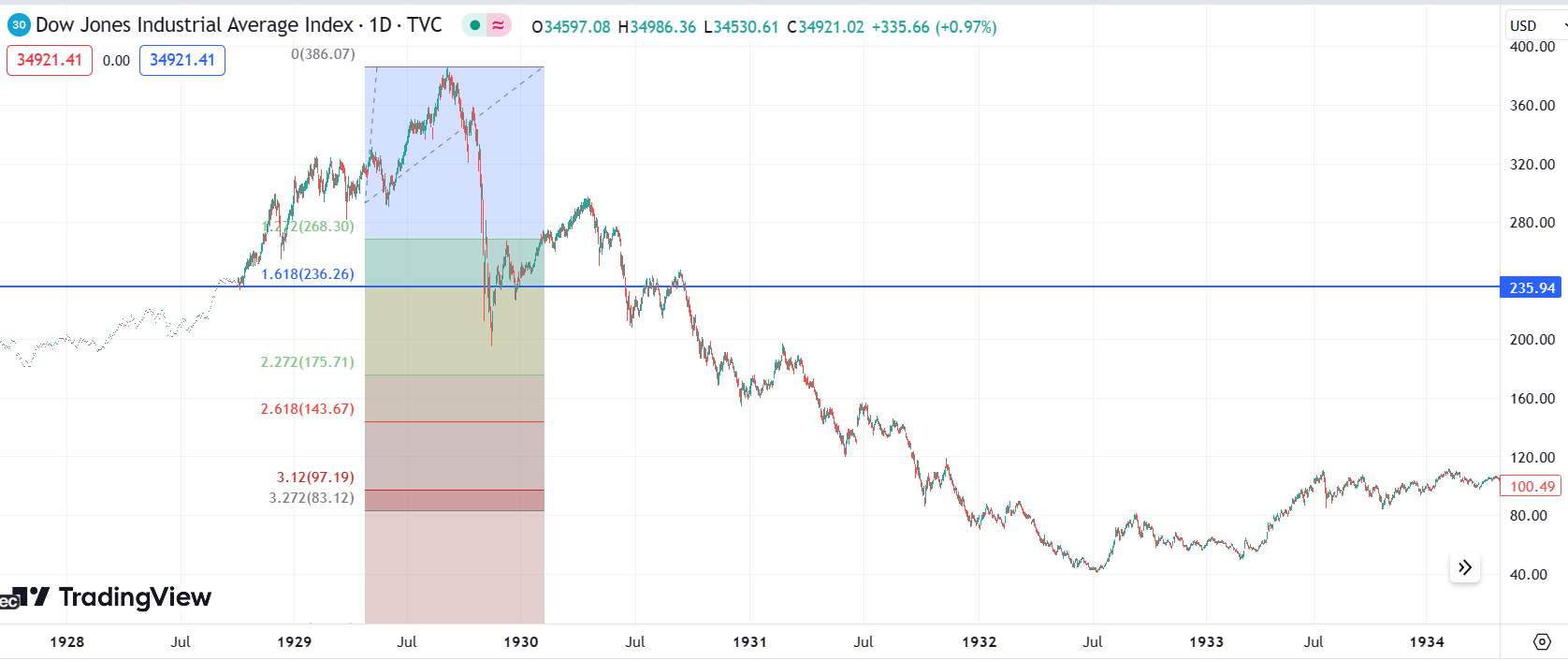
Here’s a set of fibs drawn from the point where the DJI trend lost stability.
Observations we can make here is it wen to next fibs, had some dummy crashes and then extended to the 261.
In the example of the short from the BTC high the same method was used to forecast the high

.
We can make similar observations here. The fib levels the traps come from is a bit different but the general theme is the same and it’s a 261 high.

There are various reasons I think the probability of a short here is good (One of them being I know even if I am wrong overall I’ll probably catch a fair bit of the down and up, which we have) but when we look at this area inside of the context of the fib norms we’ve just defined - this can easily be heading higher.

We’d be looking at this sort of move.

And this make sense when we apply a different rule to the implied swing. Remember earlier I showed you the 161 thing. How all the lows or first bounces were there. Well, that’s awesome. Happens so many times. I consider the breaking of a 161 a capitulation signal and it’s the obvious spot for trend continuation.
In all big market crashes I looked at a big break came when the 161 of the topping swing was broken and we then went through to the following fibs. When I apply this to SPX, there’s something that bothers me (And you’ll remember me writing about this in 2022 if you’re a long time reader). I can’t make that work.
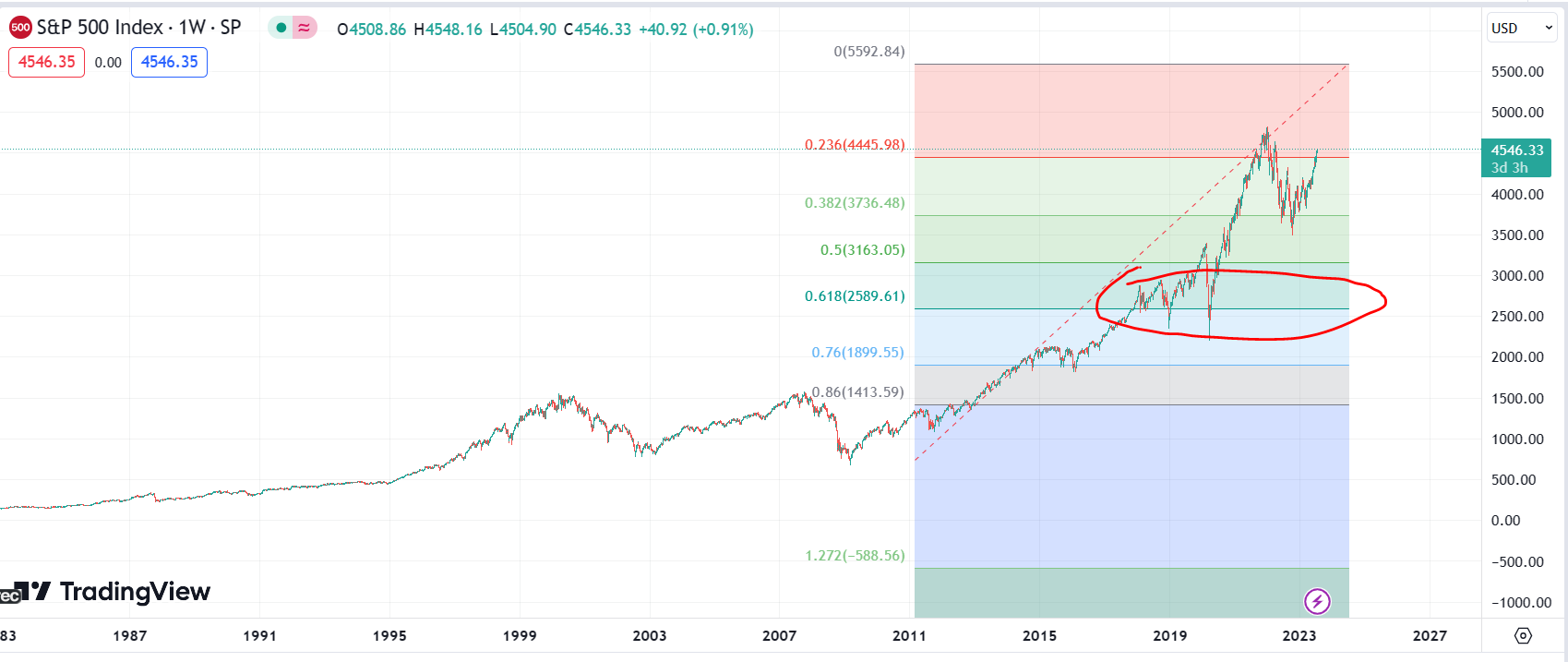
The current big topping swing is from March 2020 low to 2021 high. And it’s massive! It’s that big that when you fib it, we’d be in a depression style crash by the time we got to the 161. Which upsets the rule that the 161 will be the breakout point in a mega crash.
And this bothers me! It has nagged at me for a long time. The 161 target here does agree with the percentage a depression crash loses (And this is why this swing being high has been entertained) but in depression crashes the market has always broken the 161 and trended down to lower fibs.

Trying to apply this swing to modern SPX would have us below $0 before the 220 hit.
But if I change my assumed high and low to include a run above the previous high now that we’ve had this drop in the market, it works just fine.

If I apply some tests to this, it passes. For example, I can look at the DJI model and I can say, “Okay- if these are the same thing my expected 161 would have to be a spike out of the first bear traps”.

And that works!

My theory laid out in this post explains how I think 1920 crash may be the same as 2008, the roaring 20s may be the same as our decade rally and how this supports us being near a major top. If I work on that thesis I can see DJI 1920 crash from low to high would give me a 61 fib at the level where DJI bounced (61 and 161 match up).

And that works.
Adjusted for the new high, when I draw this fib the 61 comes in right where the early bear traps are. Where I’d be expecting my first swing low.

Also I can tie this in with the bat projection. The bat would give a 261 high but if a bat breaks it evolves into a crab. The deep crab with spike outs can hit the 423 extension - which is the level I need my high to make my downside fib levels be “Where they should be”.

The bat>crab pattern would be an exceptionally strong move. We’ve already done the groundwork prep for this for subscribers in previous post covering all our risk scenarios.
One of the most compelling signals for a short where we are is the 423 of the 2008 range, which is covered in this post. That’s so incredibly compelling because it is a multiple decade level (Took years for the 2000, 2008 and 2021 highs to form) and it’s literally a one in a lifetime signal. It’s never happened apart from 1929.
Which would seem to make this a big one to discount - and we’re not discounting it. We’re just not so sure at this point it’s a one and done gig. This level can be run and then hold the second one. This is also something I spoke of previously when explaining why a blow-off is a risk that should be considered.
As with most things related to using fibs to forecast major market reversals, I’ve used 423s before. And learned some tough lessons. Ones that have taught me the value of being ready for another spike out. And in 2021 I documented everything I did fading stock/crypto trends and can use this stuff to you now.

The trade was to short BB for a crash and I sold into the last big green candle.

Looks great now … but the devil is in the detail. The next BB trade I would take was the home run. This came after BB made a massive spike over the 423 fib.

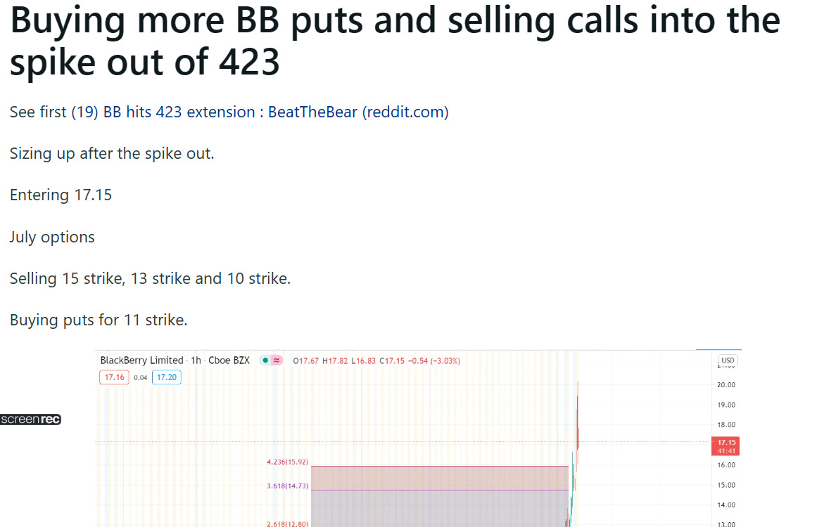
The blow-off would go from 15 to 20. Then the area of the 423 would hold a retest.

This move was over in a matter of minutes. Call spreads hit max loss and puts went to zero and then they both recovered. Stops hit on common shorts. Wasn’t too bad, because it was fast. But I’ve always known I must not make a mistake like this on a SPX monthly chart. It’d be very significantly wrong.
Given the way BB retested and dumped, I hope you can see it has to worth a shot shorting obvious confluence of sell signals here on this retest. But the market has no problem at all putting in the big spike over. Perfectly fine with it. This would still be a valid signal.

And this also makes sense. False start on the 423 and a retest of the 423 would give a classic head and shoulders with the head being a false breakout.

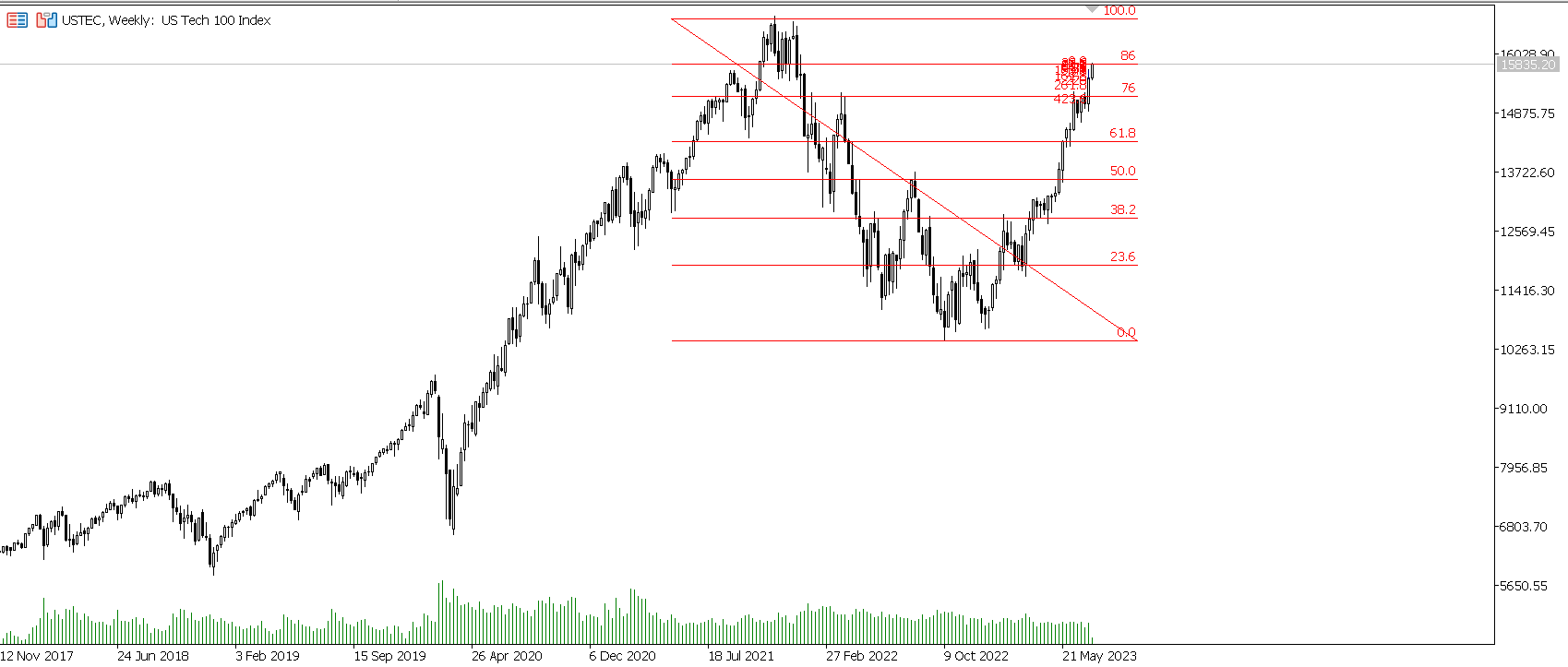
Through today SPX has ran all of the levels I expect it to turn at and broken my day trading stops. It’s not hit the swing invalidation point yet but I think it’s now highly likely it will. Nasdaq is hitting the 86 as I write this. These are not the things I’d expect to see if the bear case is valid.
These are things far more fitting with the original bias given around 3900 that we will probably make a new high. I do not think the swing bear forecast overall is shaping up to be incorrect - but I do think bears at these levels are shaping up to be incorrect.
I try to curb any excitement about anything related to a market crash. It’s not a nice thing to be gleeful about. I’d prefer it did not happen, but I do not make the rules. I also understand stocks have correct and it’s unhealthy if they do not.
It does have to be said, though, from a trader’s perspective; this would be the optimal scenario. There’s a tonne of money to be made in the swing up and it’s all the better a trade on the way down. We can forecast a narrow range for an expected high. So many ways in which this would be more profitable that catching a crash high to low from current prices.
I’ve outlines the various benefits of this type of move over a top already in when first explaining the case for a big squeeze back in November of 2021 - read more here.
SPX technically has not failed the swing signal yet, bu I think it’s going to. Also we’re that much different from what I’d expect in a bear I’d probably buy SPX if there’s a big drop before this level hits. We’ll send out actionable trade plans and positional adjustments to subscribers in the near future.
Time of writing has SPX at 4555. I think this may be a local top (Risky place to buy unless using really tight stops) and if it is I’ll buy 4513 with stop 4501. If we head on to the 4600 level, I’ll wait for a correction there for an ideal entry.
Bears would need to do something extremely special now to tempt me back to their side. I had a range of about 100 points in which I was willing to lose here, and we’ve used it. Outside of anomalous moves, the bear case appears to have failed. At some point or another, I’m going to get long for a swing trade.
Updates on specifically where, when and why once we have a few candle closes. This could be a spike out - but it no longer makes sense to bet on that. After a few closed candles, we’ll send out updated plans.
===
If you benefit from our work, please consider joining our paid list. I’ve committed to covering all the macro bear risk stuff for free. It just seems the right thing to do. Decided this in 2021, didn’t think it’d take as long, and am committed.
There are various costs to providing this and the paid subs help us do it. We will be posting far more detailed trade plans along with related education to subs.